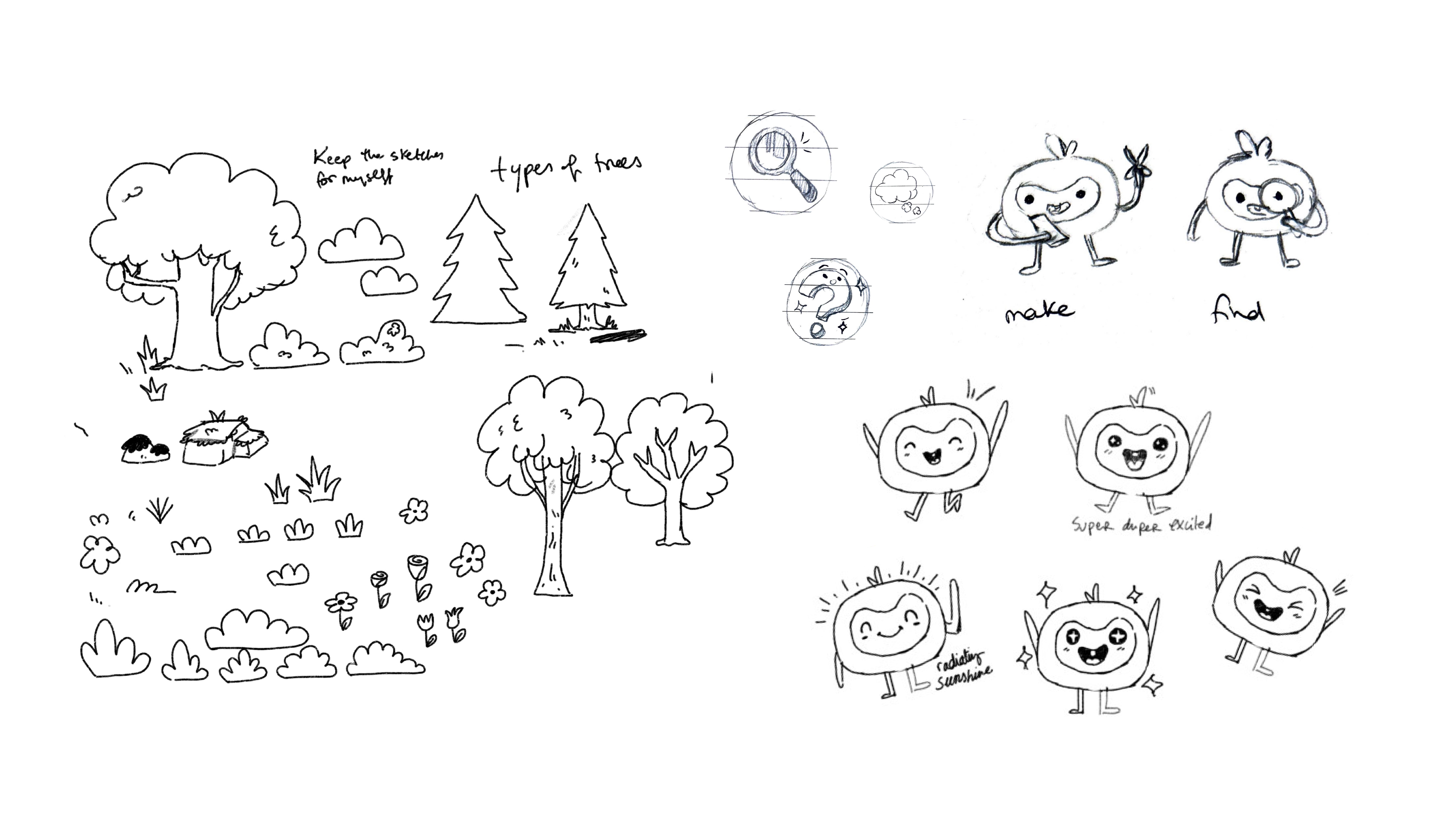
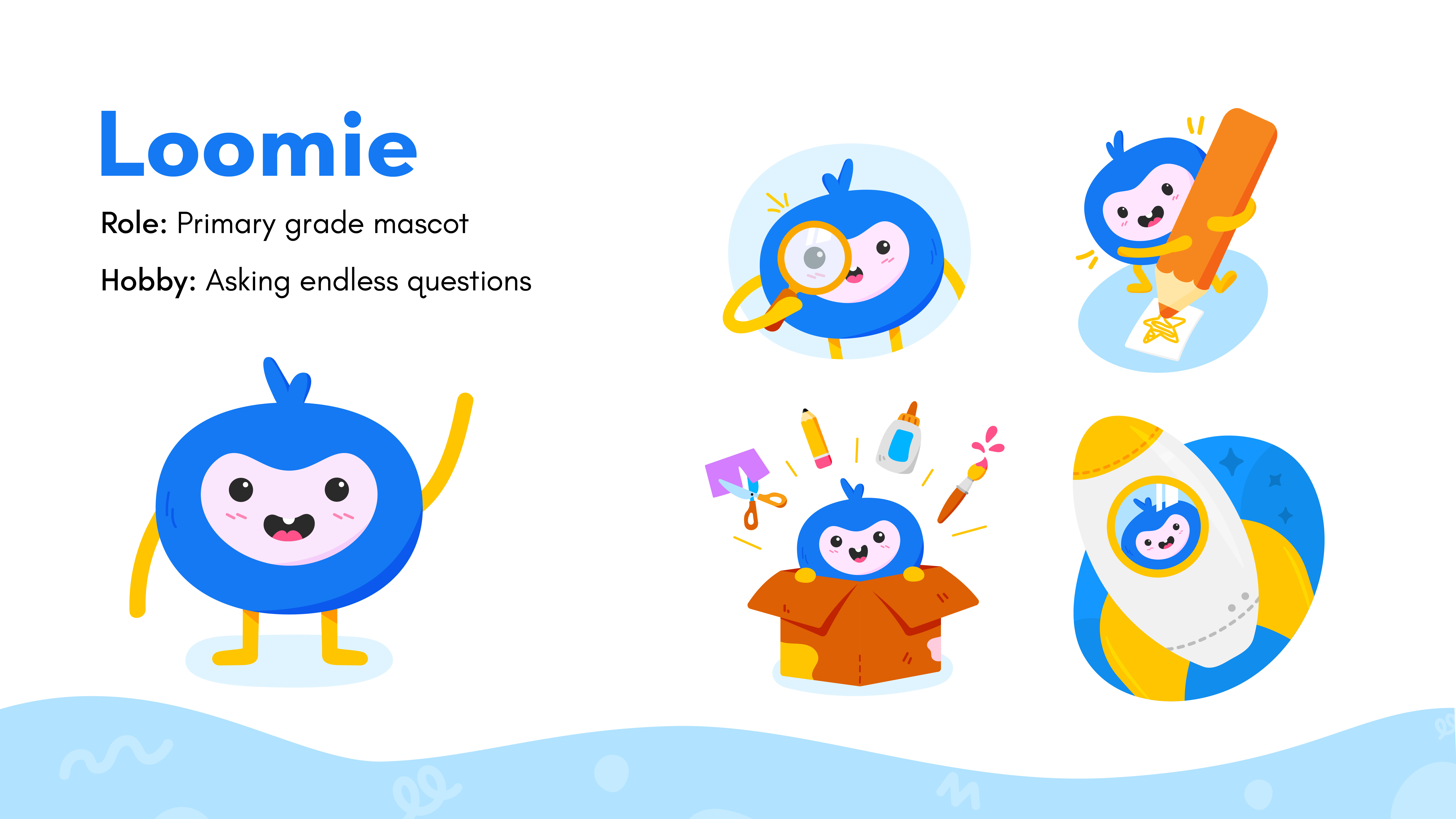
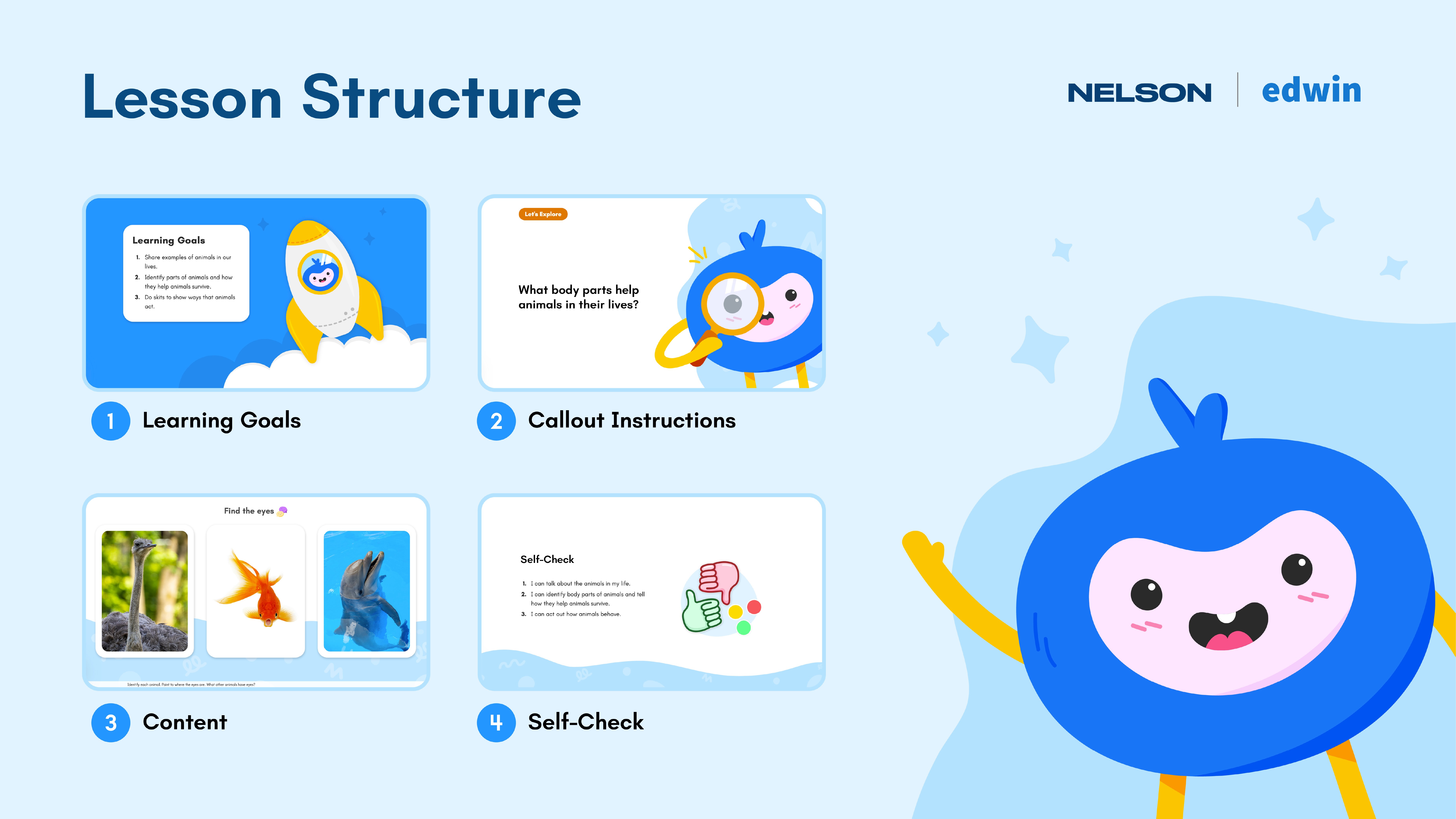
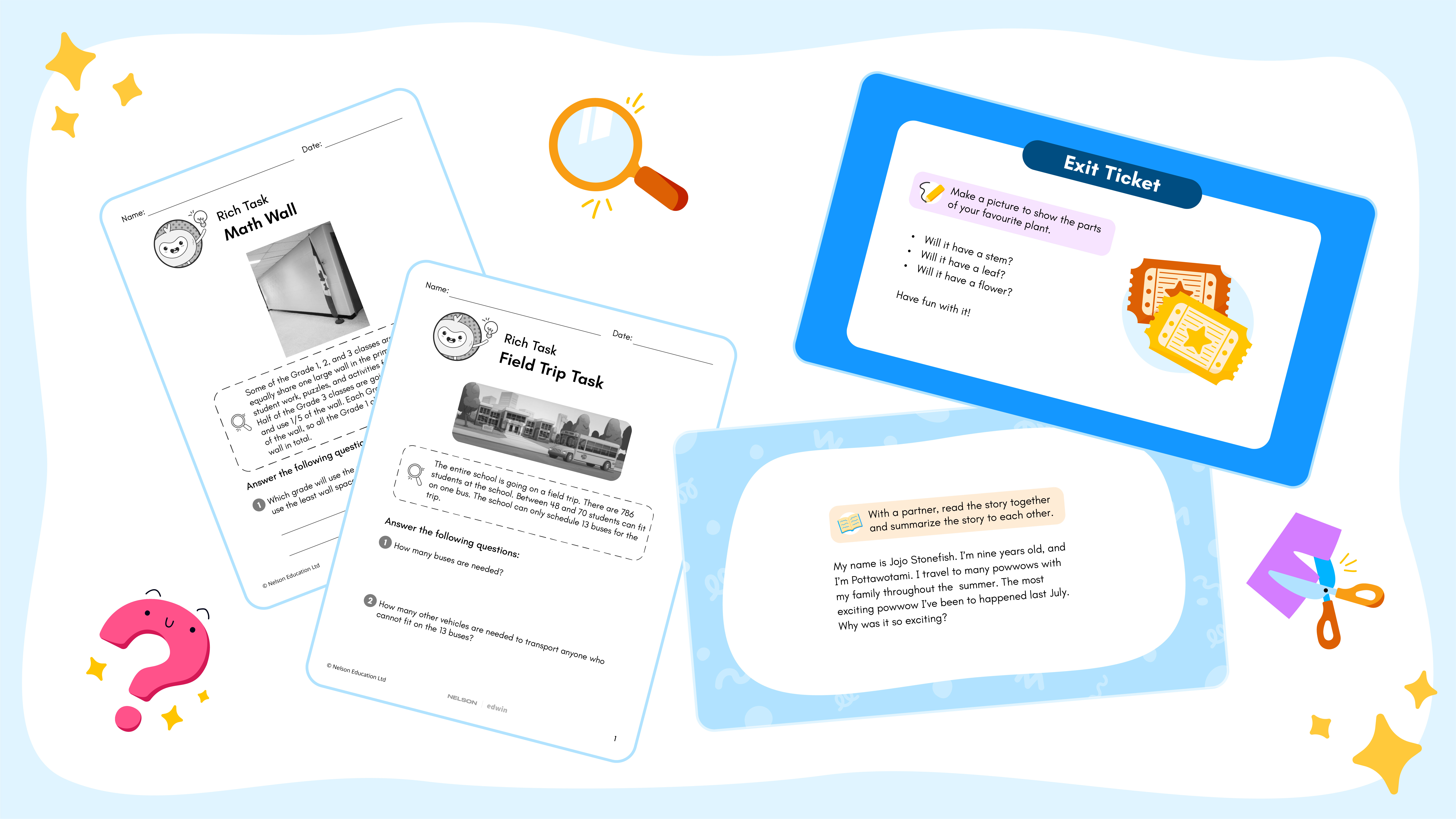
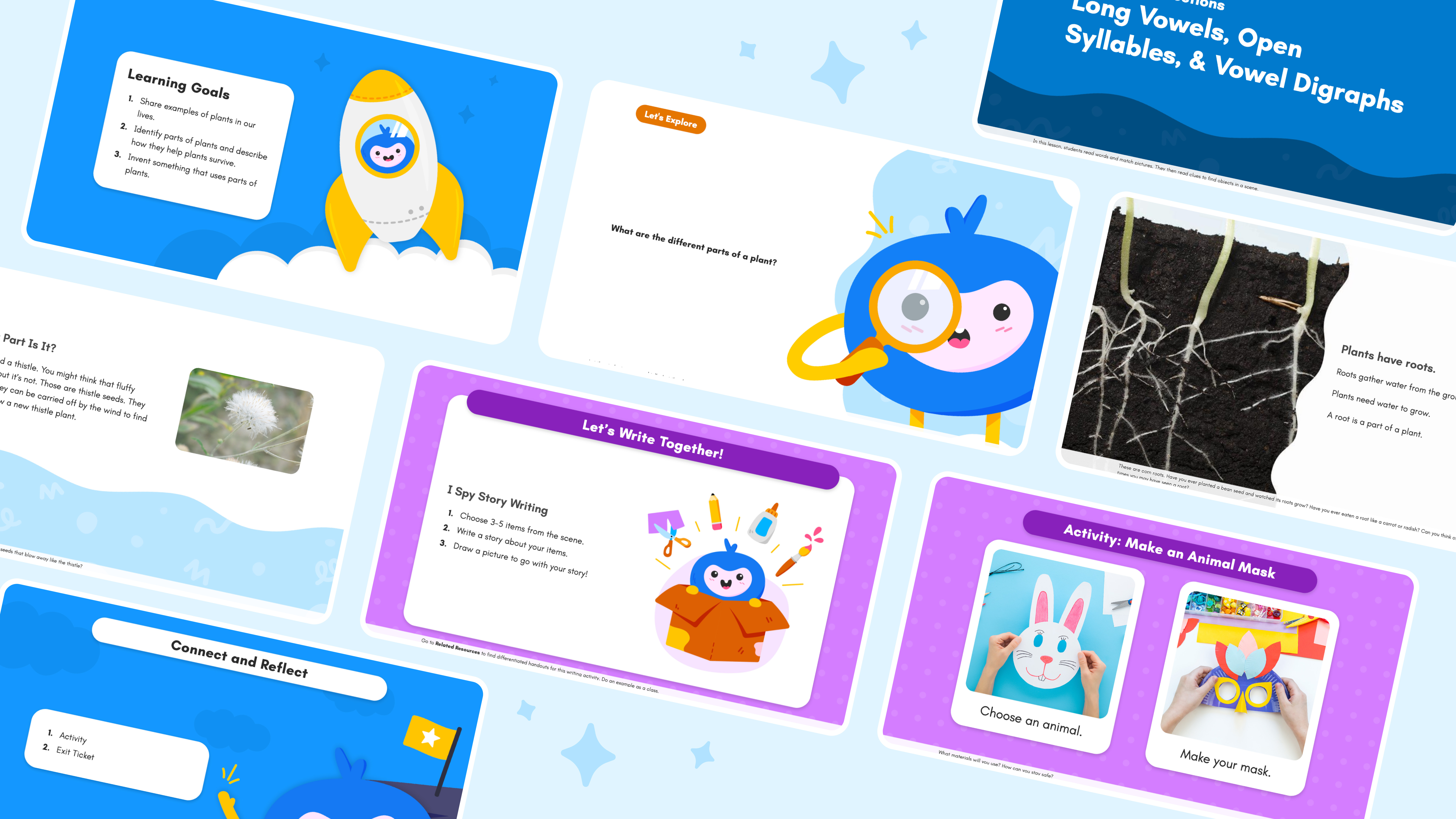
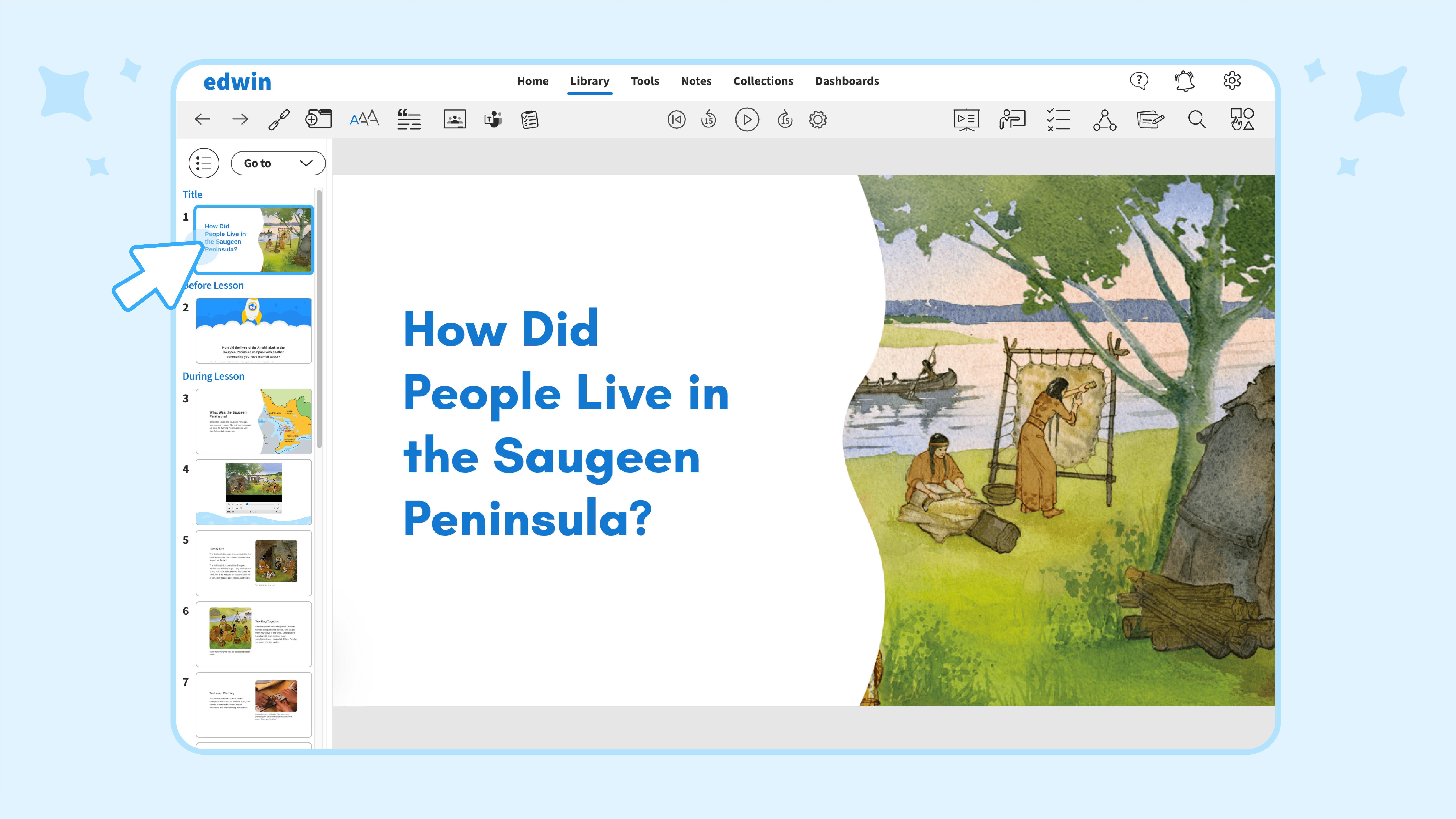
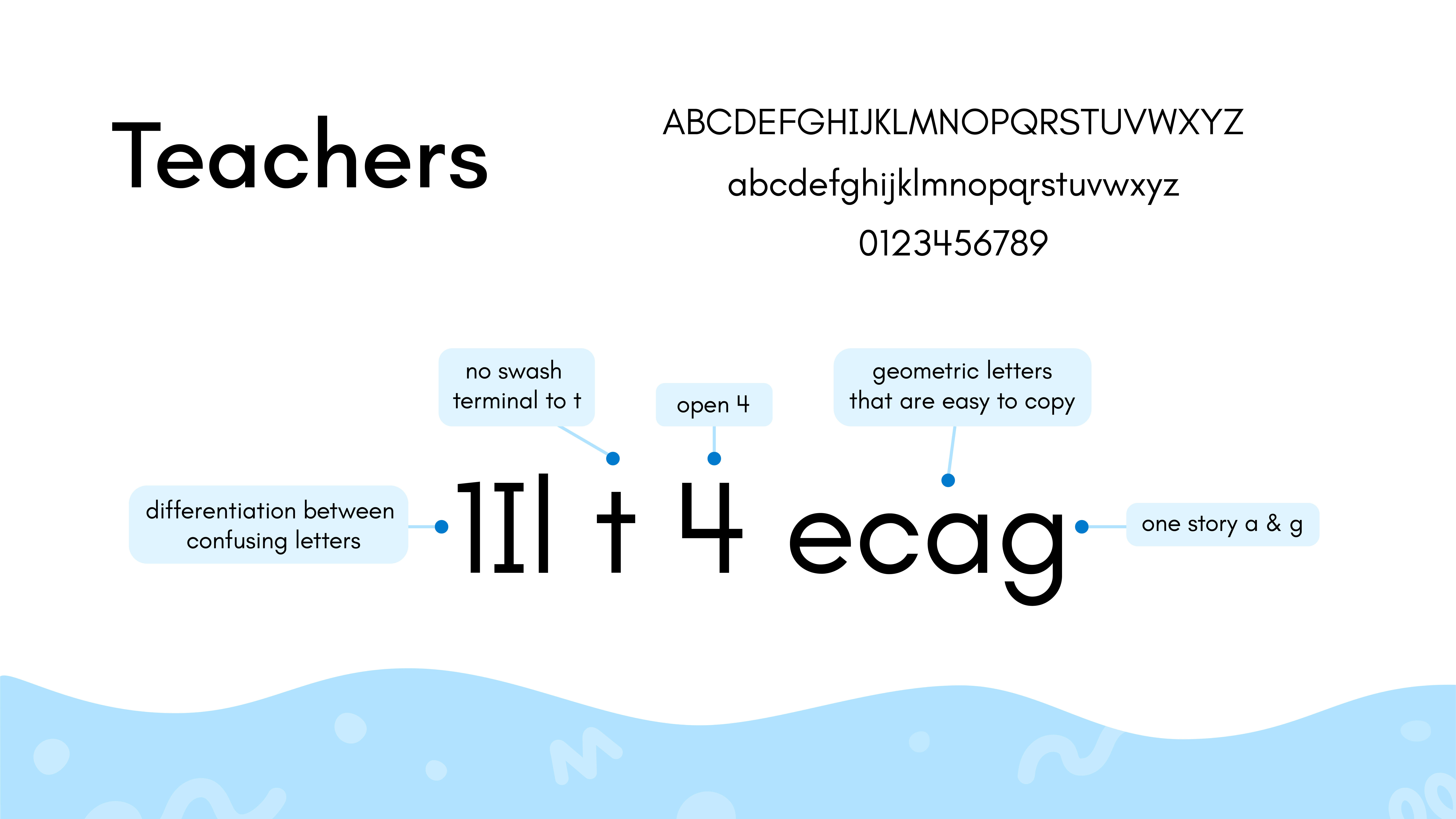
The brand identity focused on remaining simple yet engaging. Kids during that age tend to get distracted easily and digital screens can often cause information overload, so it was important to keep the brand clean with a twist of fun. Its fun lied in creating a primary mascot to engage students in key pedagogical sections of the slides, while being supported with new vibrant Edwin colors, pedagogical icons, illustration opportunities. A new primary font was introduced to meet primary students reading accessibility and support reading learning.
As an educational publishing company, it was also important to create a comprehensive pedagogical user journey for the teachers to follow through and present to the students. This required assessing key lesson moments and highlighting them with a pinch of fun.
While creating a brand was one thing, it was important to create guidelines and documentation for use of the brand for cross-functional communication with development, content, and production to ensure the brand is cohesively implemented.
